Pixel Assistant
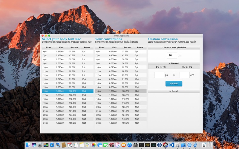
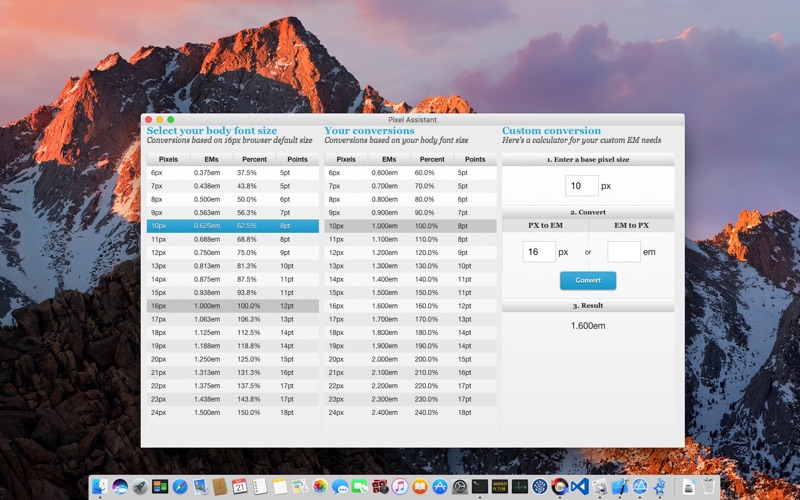
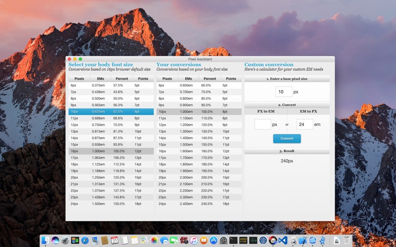
Pixel Assistant is px to em conversion made simple. Choose your body font size in pixels (px)and out comes a complete pixel (px) to em conversion table, making elastic web design with CSS a snap. The once daunting challenge of converting pixels (px) to the elusive em has now been reduced to a booger eating pipsqueak.
What is the text sizing difference between PX, EM, %, PT?
Pixels and points are static measurements, but commonly used in different mediums. Pixels are used on screens because screens are measured in pixels. Although points can be used on screen, they are the standard in printing because they are a factor of DPI.
Percent and EMs on the other hand are relative measurements. The size of an EM or percentage unit depends on its parent. If body text is sized at 12 pixels, then text set at 120% or 1.2 EM inside the body will be 1.2 * 12, or 14.4 pixels.
Note: 16px is used as the body text size in all conversions because that is the browser default. You will change 16px to your base text size.
PX to EM
Formula: size in pixels / parent size in pixels
Example: 12px / 16px = .75em
PX to %
Formula: size in pixels / parent size in pixels * 100
Example: 12px / 16px * 100 = 75%
PX to PT
Formula: size in pixels * (points per inch / pixels per inch)
Example: 16px * (72pt / 96px) = 12pt
EM to PX
Formula: size in EMs * parent size in pixels
Example: .75em * 16px = 12px
EM to %
Formula: size in EMs * 100
Example: .75em * 100 = 75%
Style sheets that use EMs are easier to maintain for the designer and more accessible to end-users.
Style sheets become easier to maintain because all text set in EMs scale to the body font-size. Only one elements font-size needs to change instead of individually changing the font-size of each element.
Accessibility is increased for end-users because text is scaled based on their preferences rather than set statically in pixels. Additionally, end-users can use hot keys to scale the text in all browsers. Many people have difficulty reading small text on a computer screen.


